Colour of the Year 2009 - 2020
We worked with interior designer Toks Aruoture to create a mood board for each Pantone colour of they year for the last 11 years. It was interesting to see how trends changed and how moods changed over the years while we were working through the colours.
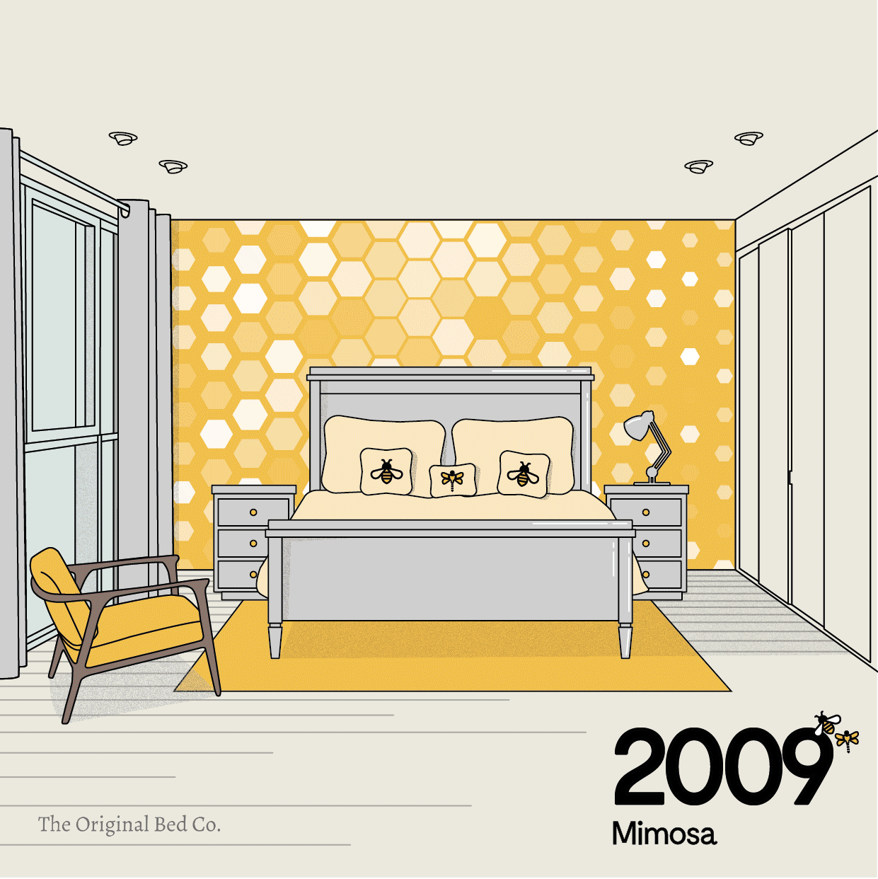
2009 – Mimosa
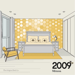
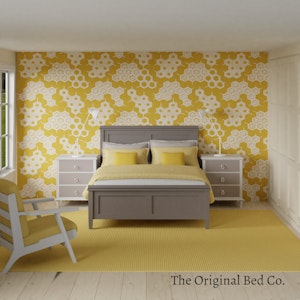
From everyone’s favourite Sunday brunch drink to the bright colours of the flowers of the mimosa tree, this colour capsulates everything we like about a summer Sunday morning. Warm and radiant yellows are still popular especially in summer and they lend a upbeat mood to a room.
Toks Says
Bees and dragonflies are popular for this colour. In 2009 trends of ethical and Fairtrade products and upcycled furniture were gaining popularity.
2010 – Turquoise
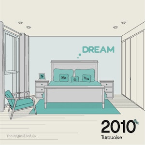
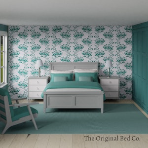
According to Pantone this colour signified escape as it reminded us of a tranquil ocean surrounding a tropical island. It is a colour that most people respond to positively, whether male or female, and is universally flattering.
Toks Says
Retro, pastels, nostalgic designs. Kitchen appliances enjoyed a comeback as retro styles became the order of the day. This was also the year grey burst on to the scenes and never left. People started to lean towards more minimalist designs – decluttering was a big word. Typography prints were also popular and the general mood of this year was that of wellbeing.
2011 – Honeysuckle
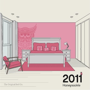
A colour embodying “verve and vigour”. This colour was meant to uplift our moods and help us face everyday challenges head on with confidence and courage. Honeysuckle (and it’s bright pink cousins) are particularly powerful in interior design as accents and are an inexpensive way to add a little pop your your spaces.
Toks Says
The trend shifted to bringing the outdoors in with an emphasis on plants and beautiful outdoor furniture. People at this point had become fully aware of eco-living which gave rise to green design. There was also an increase in energy efficiency appliances, technology began to play an even more essential role in our lives and appliances are designed with aesthetics in mind. I’ve added a fetching owl print with an outdoors mood to showcase this playful colour.
2012 – Tangerine Tango
An orange which combines the depth of emotion and rush of red and the mellow warmth of yellow. This orange captures a radiant evening sunset, vibrant and full of heat and energy. Pantone chose this orange red because they felt it embodied the need of people to recharge and move forward.
Toks Says
Geometrics was the order if the day. Wallpaper, furniture and decor appeared in geometric designs. People becsapphireder and started to use richer, bold colours like orange, sapphire, and yellow and not just in accessories but on their walls too. Warm and luxurious materials used include marble, wood, leather and glass.
2013 – Emerald
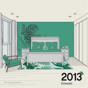
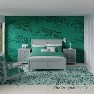
Brilliant, magnificent, luxurious and sophisticated, this colour takes many of its values from it’s namesake gem. This vivid green is meant to enhance our sense of well-being by promoting balance, energy, renewal and prosperity. It represents healing and unity.
Toks Says
Prints – Corals, safari
Pastels, metals like brass. New designers emerge with daring furniture designs like animal shaped stools, abstract designs and the likes. Natural materials like wood are seen in interiors more than ever. A mood of nature and the natural world is a trend with prints of corals and safari themes.
2014 – Radiant Orchid
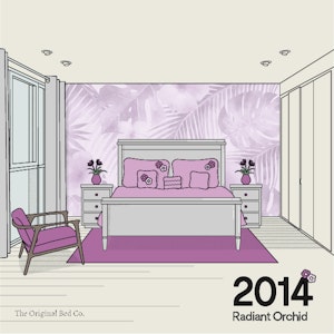
From the peace and harmony of Emerald Pantone choose the joy, love and health of this embracing purple. Radiant purples can be used to energise a room dominated by greys. This particular purple compliments colours from the green pallete like olive, turquoise, teal and even some lighter yellows.
Toks Says
Furniture: Light wood, sculptural artwork, leather and more natural furniture. Gold decor and furniture. Prints: Tropical plants, Flowers
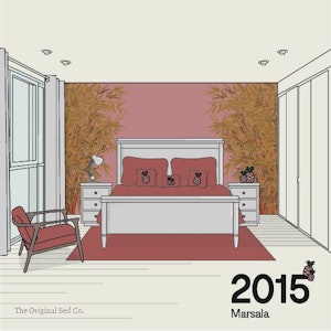
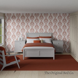
2015 – Marsala
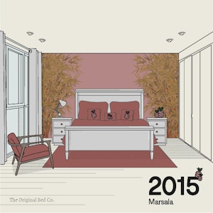
The deep red maroon (or burgundy) hue of Marsala was chosen for its “impactful, full-bodied qualities”. Sparking the feelings of passion and embracing warmth, marsala works well in a bed room as accent pieces like rugs, lamps, lampshades or pillow covers.
Toks Says
Furniture: statement lamps, a brass/ gold furniture, luxurious fabrics like velvet and chenille, combination of rustic and retro styles. Prints: Pineapples, Bamboo
2016 – Rose Quartz & Serenity
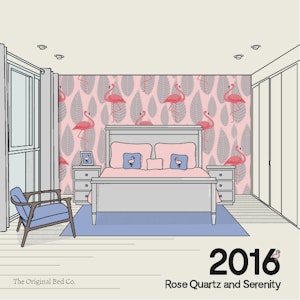
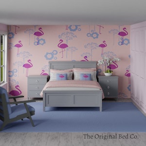
Like yin and yang, pantone chose two colours which together worked to help people destress from their everyday lives. With the warmer tone of the rose and the cool tone of the blue this pairing shows the tranquililty between each colour and spark the feelings of wellness as well as peace. These colours can be used together with many mid-tone colour pairings in a bedroom such as greens, purples, rich browns and shades of yellow/pink.
Toks Says
Furniture: Natural, eco-friendly, mirrors as deco, wallpaper. Print: Pink Flamingos on a background of a cool blue sea
2017 – Greenery
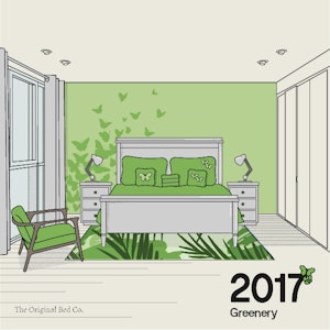
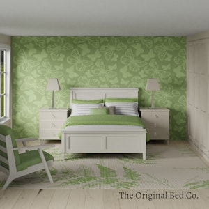
A fresh green with just a hint of yellow, a colour to signify the feelings of refreshment and renewal. The greenery colours reminds us of the beginning of spring with the lush green grass pushing us to pursue personal passions and improvements to rediscover ourself. In the bed room, waking up to a flash of green sets a positive mood to the day.
Toks Says
Furnishings: textures, faux finishes, hexagonal shaped pieces, brass, sustainability. Print themes were natural reminders to greenery including butterflies and tropical leaves.
2018 – Ultraviolet
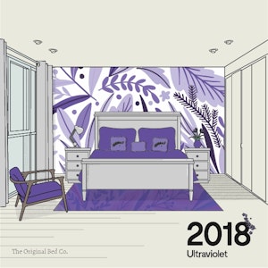
Pantone looked at the cosmos to choose a deep shade of enigmatic purple. Looking to inspire artistic creativity, curiosity, individuality and non conformity, purple has long be iconic with artists who brought to the forefront ideas of personal expression. We believe that the bed room epitomises individuality and often think of it as the inner sanctum in our houses. Where we can express ourselves free of judgement even from our closest friends and families. And so it should be given it’s the place where we can retreat to physically and mentally to rejuvenate and revive.
Toks Says
Furniture: Chunky knits, black accessories, vintage, deep blue walls. Prints: Botanicals
2019 – Living Coral
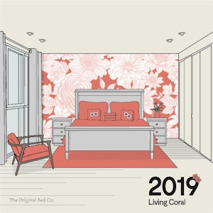
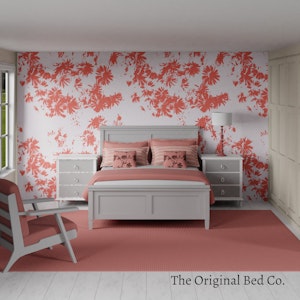
Vibrant and joyous, Pantone chose living coral as a reaction to our increasing digital life and our need to real and authentic connections to those around us. This colour is meant to encourage the feelings of joy we get in activities such as meeting our friends for brunch or spending meaningful time with our partners.
Toks Says
Furniture: art deco styles, 70’s Scandinavian, unfinished wood. Prints: Large Scale Florals
2020 – Classic Blue
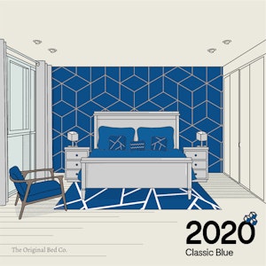
Pantone’s Classic blue is a bright navy or denim colour which Pantone describes as “timeless and enduring”. The colour is meant to represent a stable foundation for the year and the colour should instill a sense of peace and tranquility to people.
Toks Says
Trends: Biophillia, Stark contrasts. Prints: Bold and Geometric Designs
Which colour should we choose for our bedroom?
I think over the last 11 years Pantone has chosen colours to make us think about our changing world and our lives and the emotions we feel and should aim to feel in our day to day lives. The core values we embody as a society and should continue to aim for. The central themes in the last 10 years include love, self improvement, positive spaces, social connections, serenity and individuality.
Each of the colours, while colours of the year and a certain evergreen-ness to them and choosing elements from each and matching them with our individual tastes help us create bed rooms which fit our lives and styles. Colour really does set the mood of the room and each one of need to choose the colours in our rooms to help us lead the lives we want with the emotions we need at that particular time of our lives. Experimenting with various combinations will help you set a mood which you enjoy waking up to and set the tone for your day.
We’d like to thank Toks for helping us with this list and creating such beatiful sets. You may go and visit her at @toksaruoture.