Sherwin Williams - Upward
‘The colour found when we slow down, take a breath, and allow the mind to clear’ – Sherwin Williams.
Upward is a soft and soothing shade of blue. It embodies a sense of tranquillity and serenity, making it an ideal choice for creating peaceful and inviting spaces. This gentle hue evokes a feeling of looking up at a clear, open sky, instilling a sense of calm and introspection.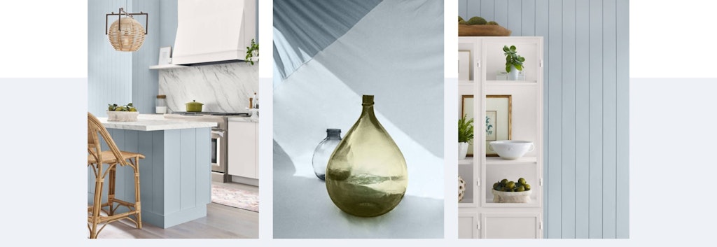
Sherwin Williams’ selection of Upward is no coincidence but a reflection of the current global mood and design trends. As we navigate a world filled with uncertainties and the need for respite, Upward embodies the desire for calm, simplicity and clarity.
Incorporating Upward into your bedroom
Upward pairs beautifully with neutral colours like white, beige and grey.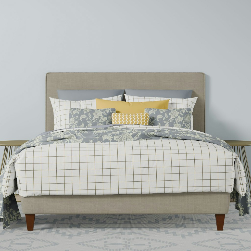
Add depth and warmth to your space with rug, curtains and cushions.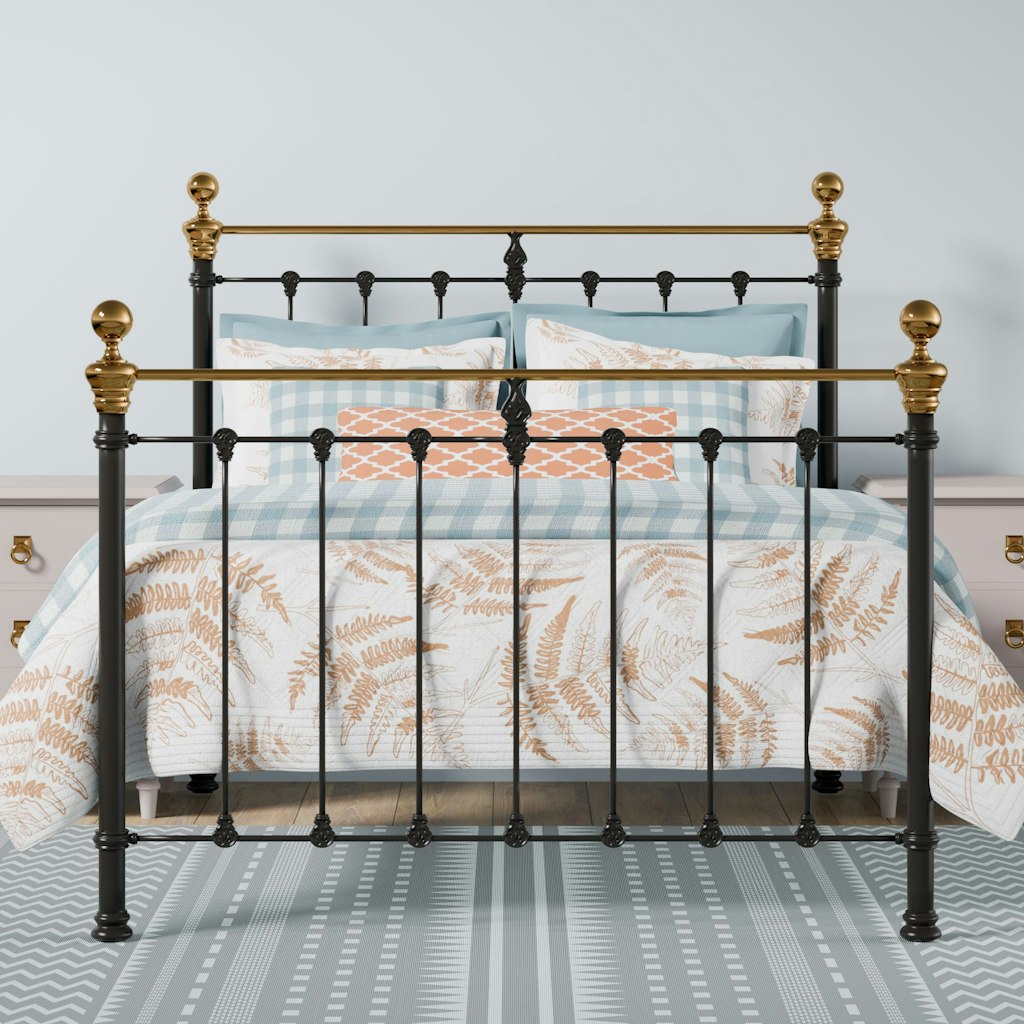
Incorporate complementary colours such as soft greens, muted corals or warm yellows in your decor accessories. 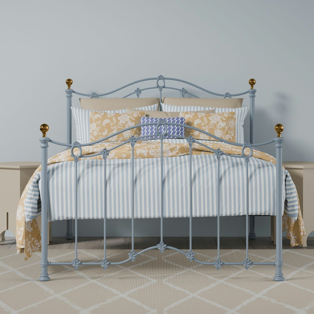
Combine natural elements like wood or stone to create a harmonious and calming atmosphere.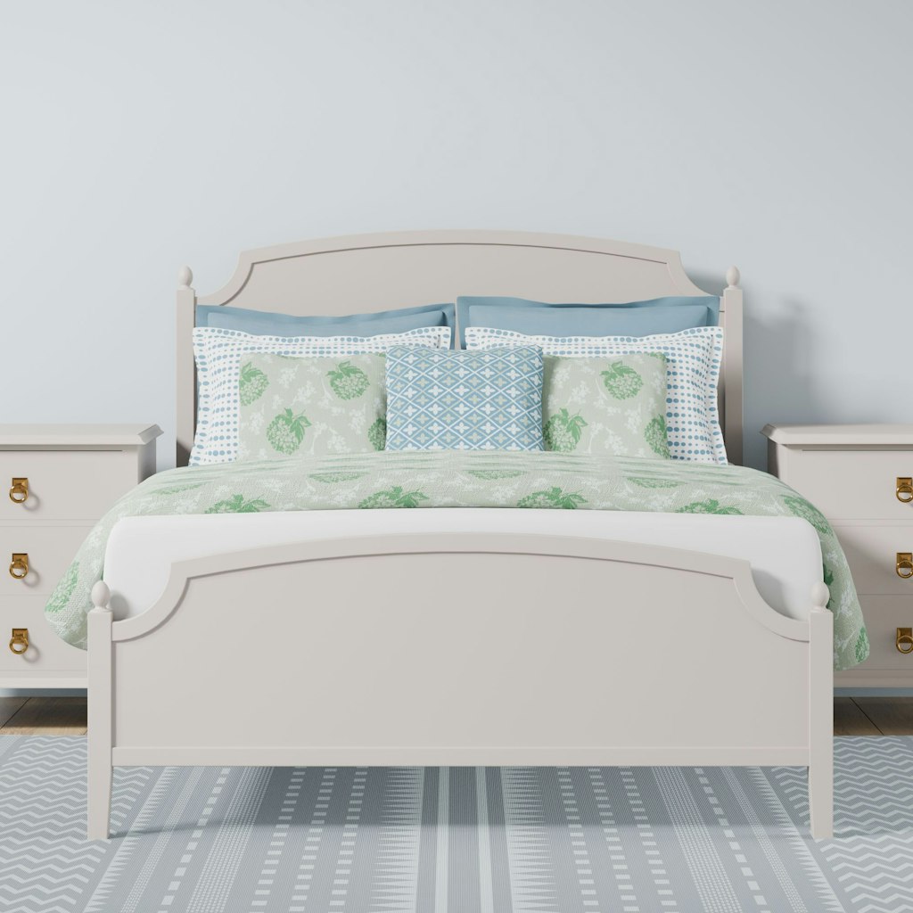
What does Upward pair well with?
Sherwin Williams have given us 7 colours which can compliment their colour of the year. The various colour combinations that can be made open up the opportunity to give your room a truly unique atmosphere and style. These colours set the foundation for Upward to be the showpiece, whether used in abundance or as subtle accents.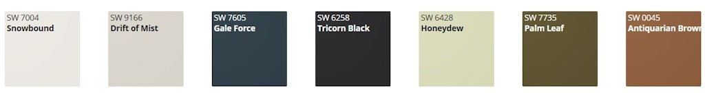
Conclusion
Upward by Sherwin Williams is a colour that transcends trends and speaks to the desire for tranquillity and simplicity in our lives. Take inspiration from the sky and embrace the soothing beauty of this hue whether it is used as an accent or a primary colour.